
StartOut
UX Project
StartOut was a project where the team that I was working with looked to increase the connection between online mentors and their mentees.
Project Background
StartOut Australia (StartOut) is a Health Promotion Charity focused on reducing the burden of poor mental health for young people of diverse sex, sexuality or gender (DSG). It has an online chat platform that is used to help mentor young people (16-25 years) anonymously.
Their challenge is when people are first connected they often lose interest quickly or get stuck with what to talk about and the rapport between mentor and mentee doesn’t stick. The objective was to find ways to increase the participation for both parties in a friendly non-intrusive way when the chats go quiet. As the quarantine period to help stem the spread of COVID-19 had just started, this project would have to take place entirely online.
Initial Research
The affinity map produced from the initial interview.

From the client meeting our team was able to come up with a list of assumptions that we wanted to test through an affinity map. These included that it would be hard to build a relationship online through anonymous chats and that the time from being appointed as a mentor to the time a mentor received their first mentee was a long time and a pain point. We came up with a research plan to interview 3 mentors and 3 mentees to find out how they felt using the StartOut website.
The Interviews
Our team was not able to interview any mentees. This meant that we had to develop all of our insights from the mentor interviews.
From our interviews with the mentors available we found that there did seem to be a large gap between the mentor being allowed to mentor and the mentor being assigned their first mentor, that mentors received very little feedback about their mentoring and that the mentoring experience was very much determined on whether the mentee wants to chat with the mentor. As the mentors we interviewed all had relationships with their mentees that were at at least over a month old, we were unable to prove that the mentor/mentee relationship only lasted a short period of time.
The Insights
The interview with the mentors reviewed a number of insights such as;
-
The mentors had only been mentoring for a short period of time (around 6 months)
-
The mentors felt that their training was good, but there was a long gap from when they finished their training to when they were assigned their first mentee
-
Mentors seemed to be isolated from each other
-
Mentors don't appear to mind mentoring a person who is anonymous to them
-
Mentors don't really get any constructive feedback.
From our insights, we came up with a series of pain points, some of which included:
-
The gap between training and when mentors get their first mentee is very big
-
There's a lack of ongoing training and support.
-
If the mentee cannot or does not want to talk, then it can be hard to maintain that relationship
-
Mentors aren't being notified via the online platform when a mentee has reached out to them
-
Mentors may find the current mentoring process a little ambiguous. They would prefer a little more structure.
Mentor Journey Map
Our team created a journey map to outline the journey from a person applying to be a mentor through to finishing a relationship with their assigned mentee.

We inserted pain points into the journey map to highlight where mentors were experiencing issues.
Wireframe Sketches
These sketches were created during the ideation process.


Ideation
We came up with the following problem statement to focus the ideation of our initial solutions:
"Mentors need more support to be available so they can be more confident and effective when they are mentoring in diverse situations."
We then had a check-in meeting with the client.
During this meeting we found out that they were in the middle of their re-brand, and they were looking at implementing some of the concepts that we had come up with!
This forced us to revisit our ideas, striking out the concepts that StartOut were working on in the background. We worked out that the there was an opportunity for us to focus on providing solutions to the lack of feedback that the mentors were not getting and to offer some additional support in providing some interim training.
Solutions
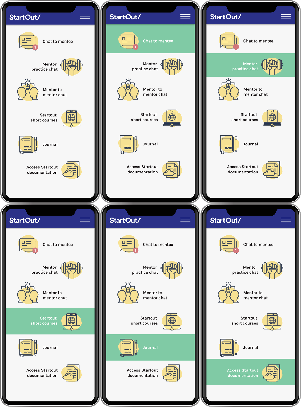
Our final deliverable was an application specifically aimed at the mentor. This application would link most of the features that we came up to help the mentors as a user-friendly asset that a mentor could access on their phone. I was responsible for the application 'look and feel', the Emoji Notification, the Mentor to Mentor Chat, the Mentor Short Course and the I'm OK button features.
Solution 1 - StartOut Mentor App
The first solution that we offered was an application specifically aimed at the mentors which has more features than the current website and allowed mentors to access the other solutions that we
came up with.
 |
|---|
Solution 2 - Emoji Notification
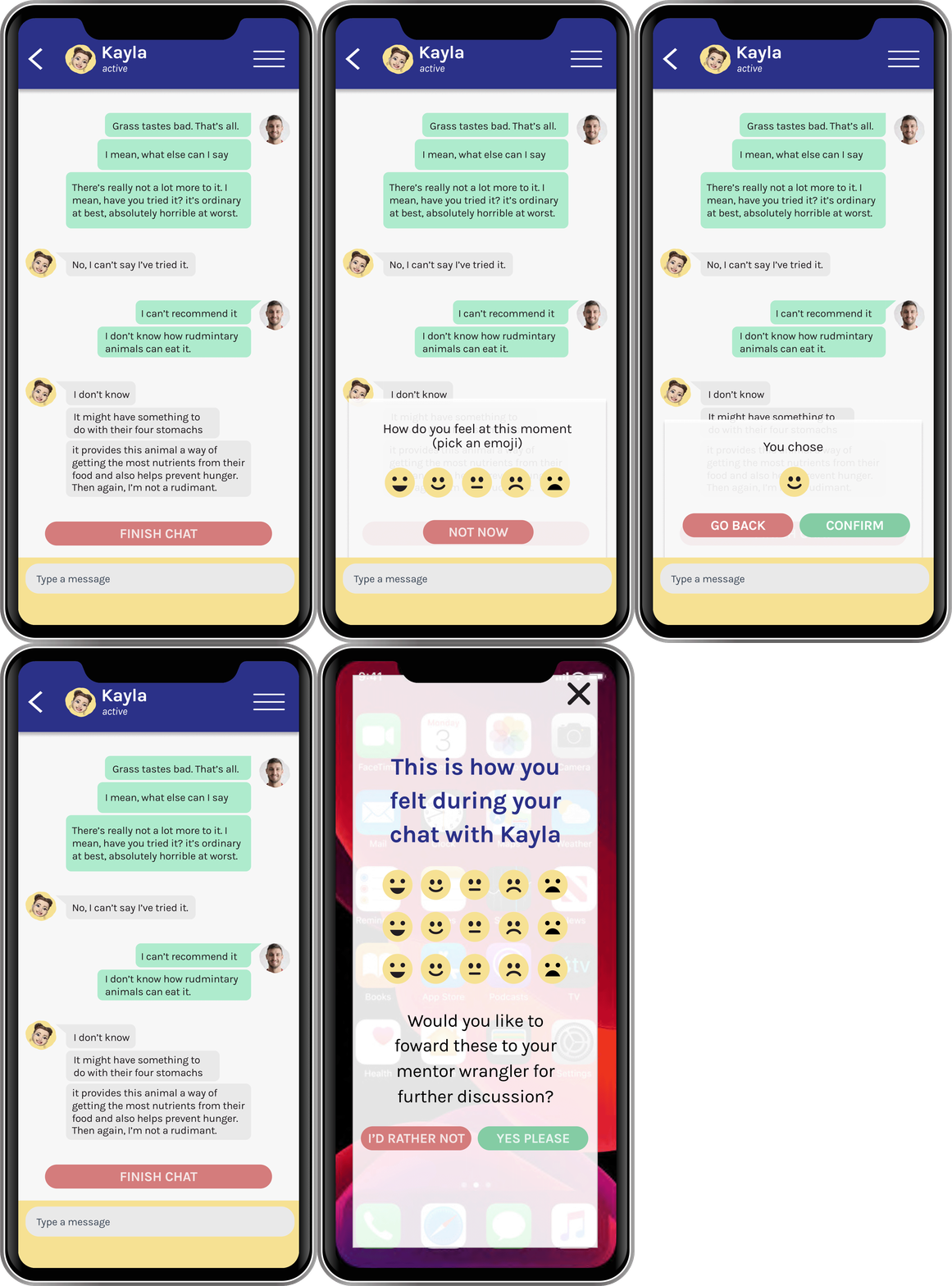
The Emoji Notification was conceived to address the lack of feedback that a mentor gets.
The mentor would receive a notification that asks you to rate a certain period of a chat with a mentee. The mentor is asked periodically to pick an emoji to represent how they feel at that point of the chat. At the end of the chat, the emojis are tallied to show how the chat went. This emoji tally can be sent to a mentor wrangler if the mentor wants to discuss the chat later.
 |
|---|
Solution 3 - Mentor Practice Chat
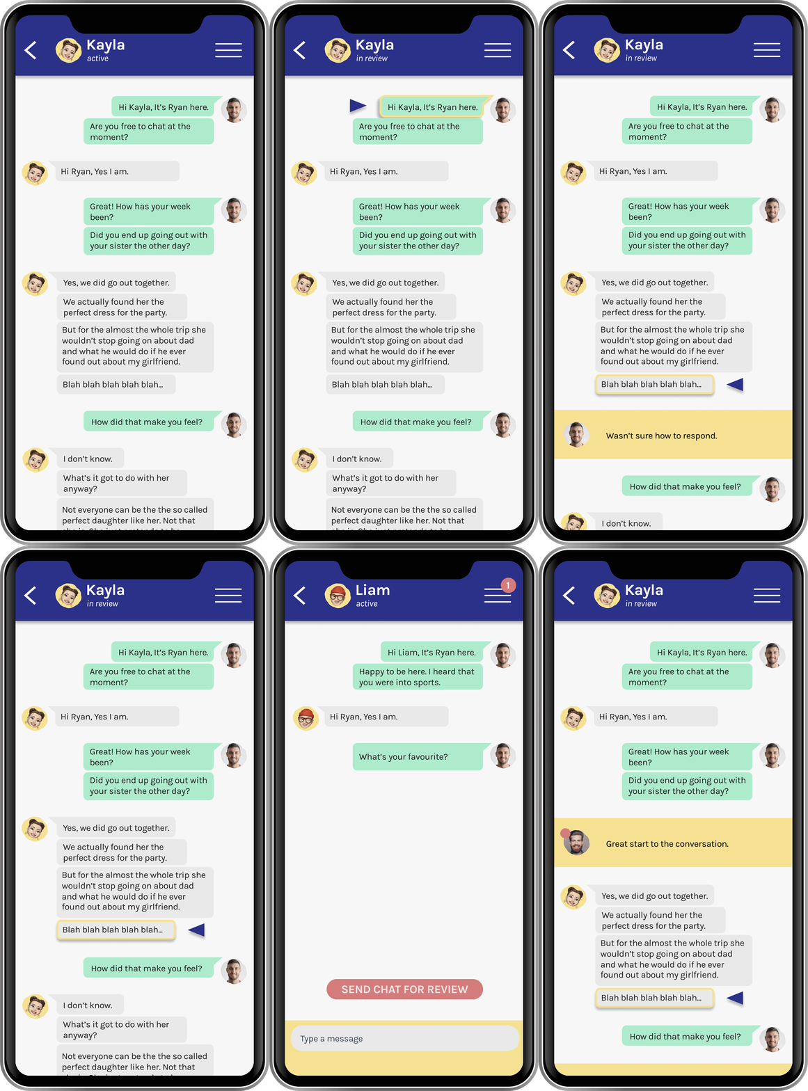
To address the amount of downtime that a mentor might experience, the idea of the Mentor Practice Chat is to give an opportunity for mentors to practice their skills with other mentors who would role play the part of the mentee. This chat can then be sent to a mentor wrangler (manager) for feedback. Both mentors will also be able to comment on the chat.
 |
|---|
Solution 4 - Mentor to Mentor Chat
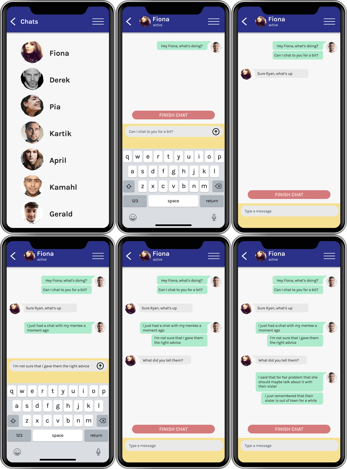
Mentor to Mentor Chat allows mentors to chat to mentors, so they can share their experiences together. This would a sense of community between the mentors, allowing them to support each other.
 |
|---|
Solution 5 - Mentor Short Course
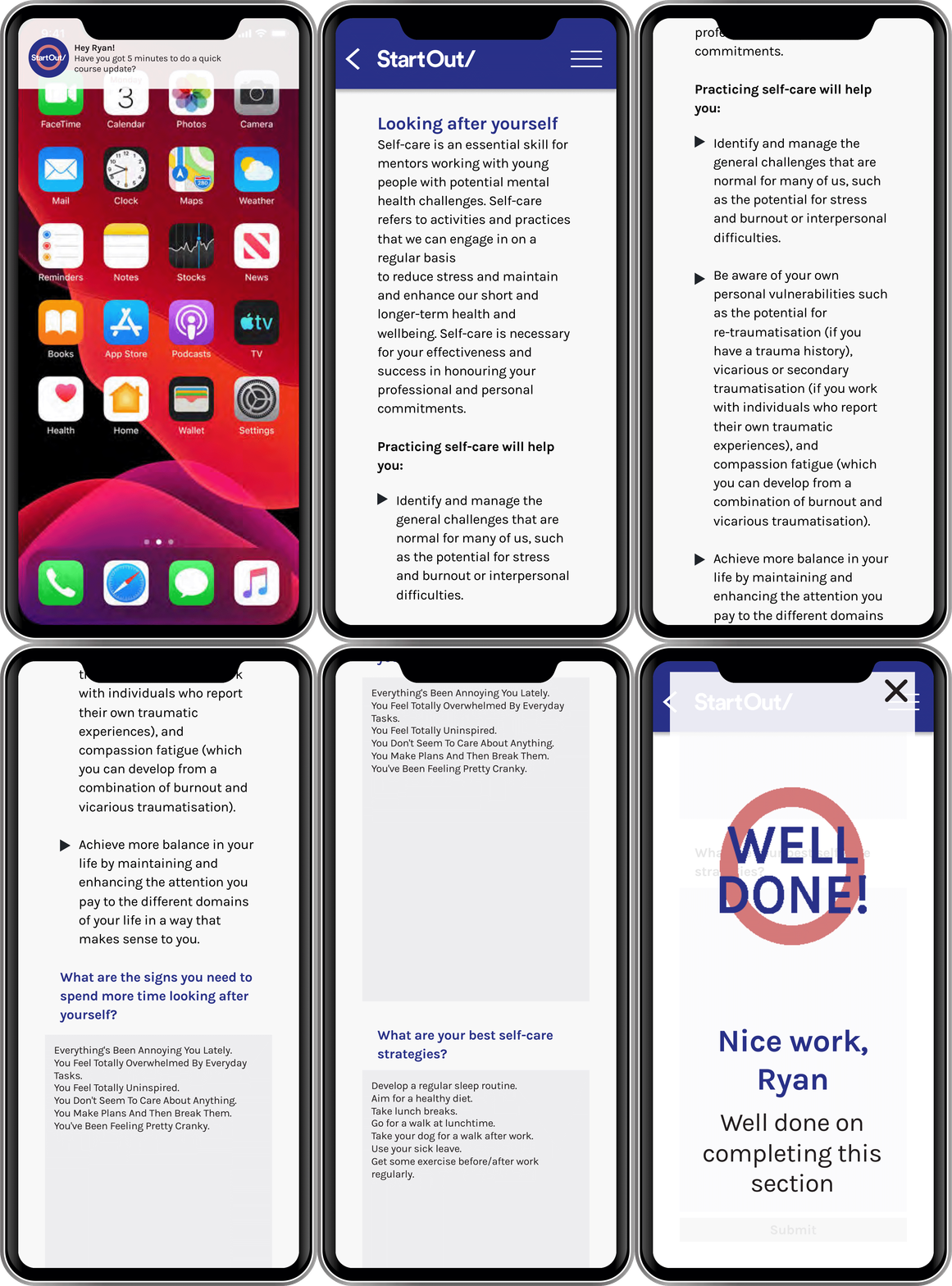
Short Courses are a way to allow mentors to be able to revise their mentoring lessons in a series of 5-10 minute sessions. Once a week, the mentor would receive a notification asking them to do a course.
 |
|---|
Solution 6 - Live Journal
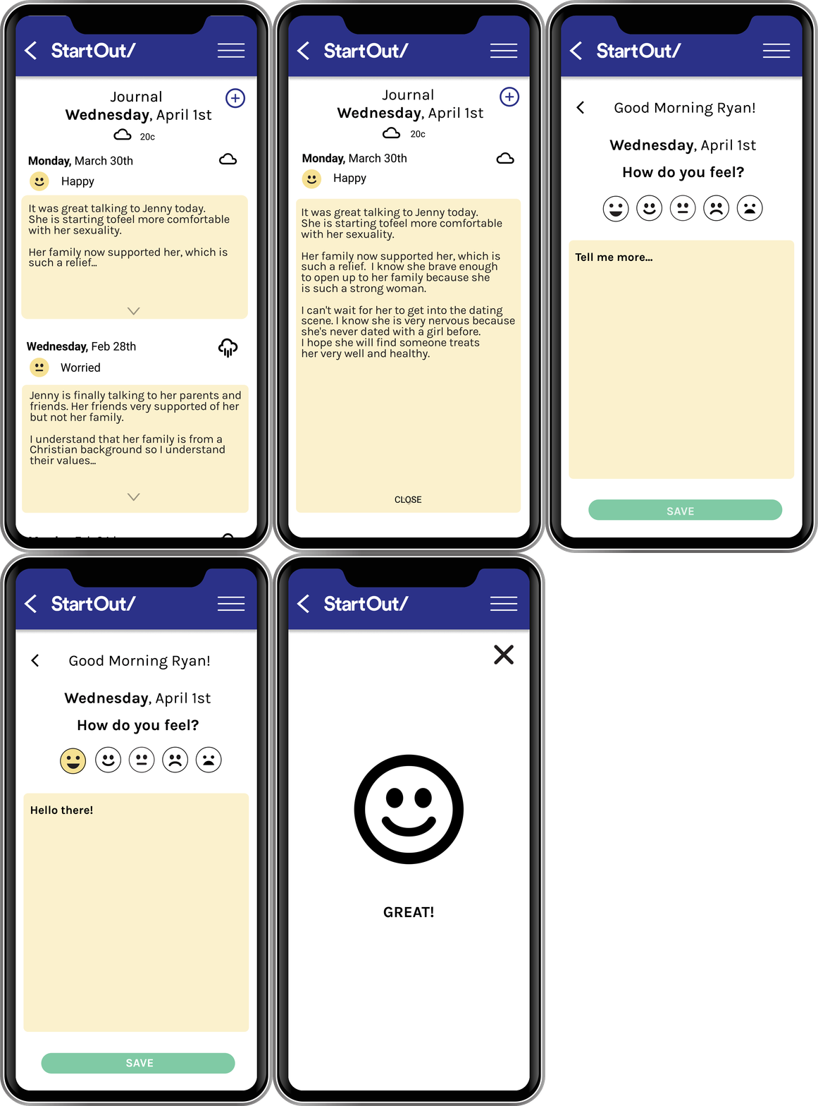
Live Journal entries were conceived as a way that a mentor can diarise their sessions with a mentee. Mentors are able to document the conversation after chatting with a mentee. This helps to record the development in the mentor/mentee relationship to reflect and deliberate on how to move that relationship forward.
 |
|---|
Solution 7 - I'm OK Button
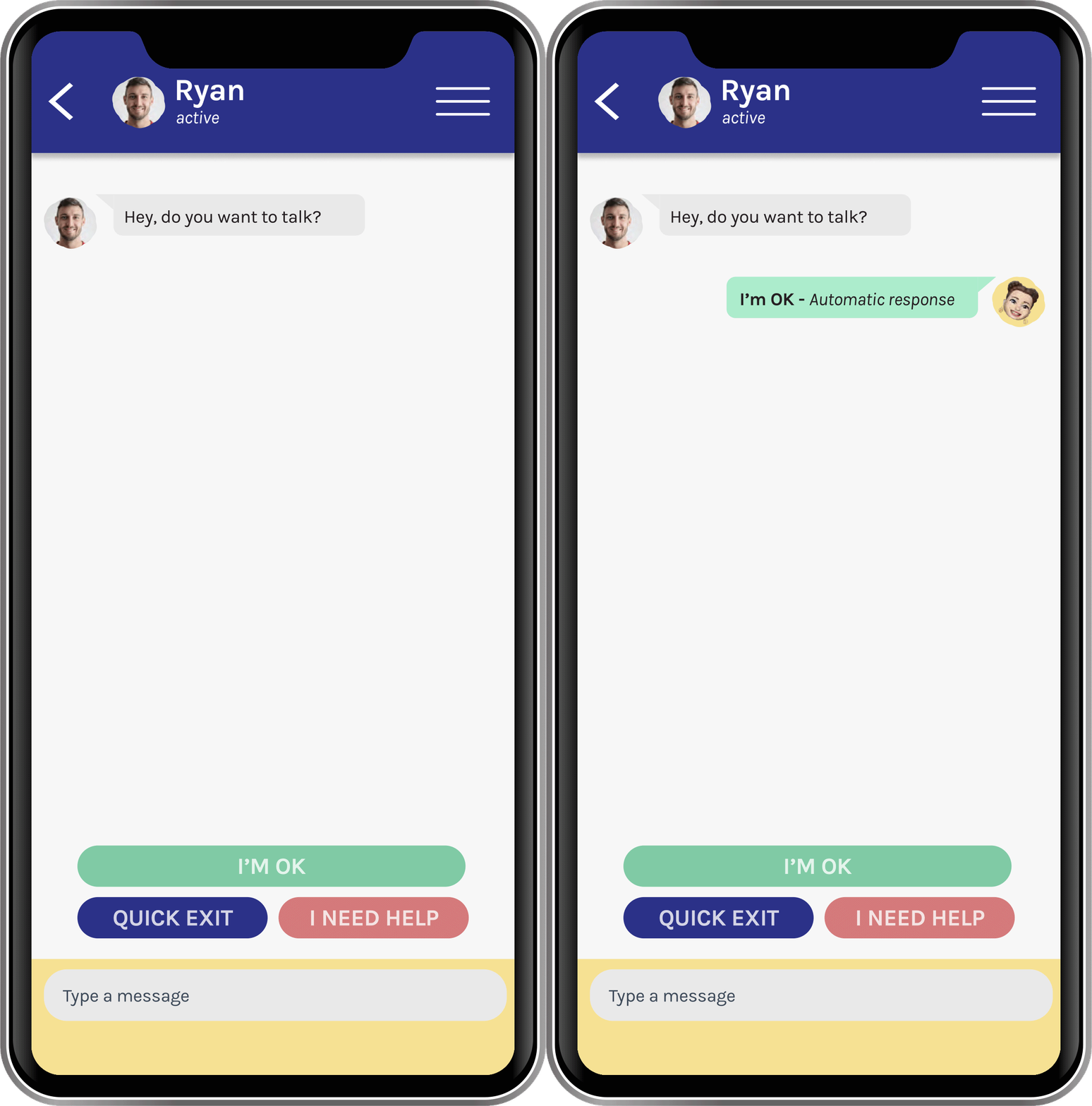
The last concept that our team came up with was aimed at the mentees and would be an addition to the current website. We found in our research that mentors may have long periods of time where they don’t hear from their mentee. Mentees could let their mentors know that they are fine, but they may not want to talk by pressing this button. This button would help to alleviate any concerns that a mentor might have for their mentee.
 |
|---|
Conclusion
After the solutions were presented to the client, the client took some time to process what we had offered. They were very enthusiastic about including some of the ideas that we offered into
the new website update.
This project was a challenge for a few reasons. We were forced to work from our homes due to the COVID-19 lockdown so we had to get past the challenge of working as a team from separate locations and the technical issues presented from the internet at the time. We did not get the ideal amount of interviewees that we would have liked to, missing an entire segment that would have gave us a much cleaer picture of how the mentor/mentee relationship worked. Despite this, I was personally pleased with this project as we were able to uncover valuable information from our research that we could use to help our client.
A big thank you goes to my UX partners in this project, Tracey Wong and Thai Ha Nguyen!