Cloudwave Neon
UI Project
Cloudwave are independent contact centre consultants who offer cloud contact centre integration solutions.
Project Background
Cloudwave's services include backend architecture through to bespoke tailored desktop & mobile application design & delivery
Working as hired contractors through YUZA, we were given the task of helping to redesign the UI of their product ‘Cloudwave Neon’, which is a pre-configured set of dashboard displays that integrate with enterprise software to provide reporting services to their customers.
The kickoff meeting established our deliverables as the following:
-
Overall look and feel of the product
-
Data visualisation displays for key components.
-
Key functional components - creating and configuring dashboards.
The solution had to have the functionality to build more than one dashboard. Users would have to be able to:
-
Add, edit and delete stats from the board and configure them
-
Create, edit and delete different dashboard configurations
-
Get dashboard links for displaying on TVs.
-
Login/ Logout
The data that was to be displayed would be categorised as either Real time Data - data that is instantaneous and static; or Historical Data - data that is presented over a given period of time and calculated. There would be a number of ways that Data could be displayed including numerically, via a bar graph, pie graph line graph or a donat. Data would be encapsulated in widgets. The widgets would have the ability to be maneuvered and resized within the dashboard to create different layouts. We would have to reference Cloudwave’s brand style guide to create the overall look and feel of the dashboard
Data would be displayed on screen sizes ranging from 1280 x 720px to 3840 x 2160px. We would be using the React Material UI library to provide the core functionality of the dashboard.
Our goal for the first week would be to come up with a user flow that would show how a user would populate a dashboard with components from scratch via low fidelity wireframes
Research
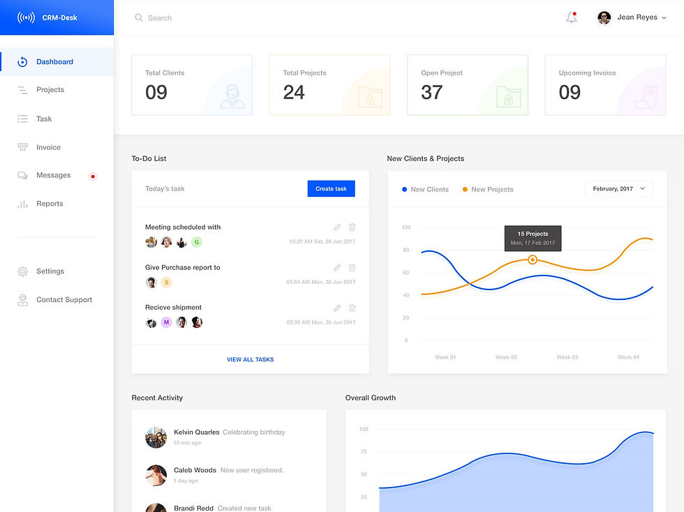
Examples of other Dashboards we researched.


Our team didn’t have a lot of experience when it came to creating dashboards, so large portions of the first couple of days were spent researching what the best user practices are, and looking at various examples of other dashboards. In the background, I was thinking about what the best way would be to organise the widgets so they would have the flexibility required by the brief.
From our research, we established that having a clear grid structure would be key to allowing flexibility & scalability in the design. We established an 8 px grid for the basis of the dashboard with a 6 x 3 grid for the widgets to be based on; This grid would give anchor points for the widgets to be manoeuvred & resized around. Whilst 18 sections of information is more than what is generally suggested for a comfortable amount of widgets to be displayed, the 6 x 3 grid is only meant as a starting point for a user to personalise their own dashboard.
Initial Sketches
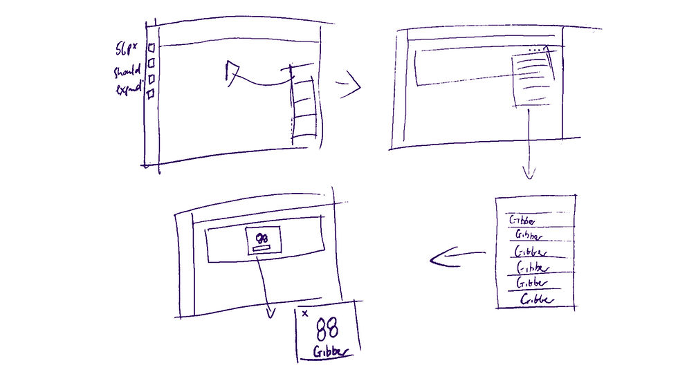
(Very) Rough drafts of concepts.


We realised that the clarity of the information presented would need to be a major consideration. The initial sketches for the widgets kept the amount of information in each widget as minimal as possible.
After reviewing our sketches, we started coming up with concepts which would become our initial wireframes.
Wireframes
The first computer generated steps


We presented the wireframes at our initial check-in meeting, and the feedback from YUZA was mainly positive. We were asked to reverse the order of options when creating a widget, come up with the flow to edit the widget and begin thinking about coming up with the full screen version of the dashboard. Revisiting how to create the dashboard was also a priority. With these notes from the presentation in mind, the team started revising the user flows and filling in the UI details to start filling out the dashboard.
Version 2
Higher fidelity proofs.


Version 2 of the dashboard would be higher fidelity concepts than the wireframes that we presented in the check-in meeting. The feature to add a dashboard was created and the ability to edit widgets and the information presented in them was fleshed out. We made changes to the work-flow in terms of how categories of information would be found. And the look and feel of the dashboard started to take shape with the colour scheme being applied, icons being developed and placement for other information that wasn’t being displayed in the widgets being organised.
Large screen versions of the dashboard began to be created at this stage with the team having to work out sizes & spacing of elements so that the dashboard would not look awkward when translated to the larger screen sizes.
Final Version
The designs handed over.


Version 2 of the dashboard was presented to Cloudwave and was well received.
Of course, there would be changes requested.
The colour themes were requested to be deleted when editing the dashboard or widgets; in fact the whole colour picker function was simplified to limit the amount of colours available. Range of time was altered so that days and hours could be searched between rather than just days. The 'Combining Widget' function was removed. Light/Dark mode was incorporated and versions of the widgets were shown in a range of colours.
We also created versions of the widgets in the different shapes and sizes which would be available to the user.
With all the changes made, the final version of the dashboard was handed over to YUZA so they could continue the pro-grammatical development of the concept.
Conclusion
Creating the dashboard for Cloudwave on behalf of YUZA was a valuable experience. Having to create something that I wasn't really familiar with whilst working remotely due to COVID-19 was a bit of a challenge but with the help of all involved we were able to create something that Cloudwave was happy with.
I'd like to thank Grank Maskell & Eva Sands for giving me the opportunity to work on this project and Ema Mestrovic for working with me.