Bites Company
SD/UX Project
Bites Company is a vending machine distributor that's looking to expand from a small base. Our team came up with a plan to help them do so.
Project Background
Born from a passion for healthy living, and a love for interesting snack alternatives for all, Bites Company (Bites Co.) is on a mission to address the lack of healthy snack alternatives in today’s market, with a fresh perspective.
Bites Co. has been running for a year and half, with vending machines around Sydney city, with different markets.
The current website audience is B2B, targeted at businesses who may want to install a new vending machine. They wanted to have more of an understanding of the interaction of potential B2B clients with the website.
Initial research
The affinity map produced from the initial interview.

The kick off meeting we had with the client established that some of the issues presented from the brief were not actually issues. At the end of the meeting, it was established that the client wanted some user profiles. However, our team's Service Designer worked out that the lead time for the sales process, from the initial contact to the sale itself was 3 months. This was a factor that could potentially prevent Bites Co from reaching their goal of doubling the amount of vending machines that they currently have installed over the next year. The team came up with a research plan that included:
-
interviewing Bites Co. B2B clients and
bounced propositions to find out why they chose/didn't choose Bites Co. -
and contextually inquiring and guerrilla interviewing B2C users using vending machines to see how they used the machines.
A series of questions were written for the interviews based off an affinity map that we created from the kick off interview.
Vending Machines
of many shapes and designs (or maybe not).

Due to the duality of the targets that we were trying to find information about, our team was split between interviewing B2B clients and 'stalking' vending machine users, with team members alternating between both disciplines.
The contextual inquiry of vending machine users also gave us an idea of where vending machines were positioned and what the users were buying.
One of the places we 'stalked' users was at the University of Technology Sydney (UTS). We're pretty sure that whilst we were observing vending machine users, UTS security was observing us...
B2C research
Coded information and observations of B2C users.

From the contextual inquiries and guerrilla interviews we were able to draw the insights that
-
value was a concern
-
a vending machine placed in a waiting area would often attract interest from people waiting in that area
-
people would be open to fresh food options in a vending machine but would be concerned about the life span of the fresh products. This boded well for Bites Co. as they were looking at introducing fresh products as an option.
B2B Research
Business Model, Empathy Map, Stakeholder Map and Value Proposition.


From the information that we got from our interviews with the B2B clients and propositions our Service Designer was able to come up with a business model canvas, an empathy map, value proposition map and stakeholder maps, which the rest of the team all had input in. This allowed our Service Designer to begin early work on a Service Blueprint. Also, a pair of personas were created, which outlined who Bites Co. clients are. All this would help us later when we began the ideation process.
Personas
Healthy Harriet and Manager Mandy.


We found that we could split the B2B clients into
2 persona types -
-
Healthy Harriet - who wants to try and improve the eating habits of those around her
-
Manager Mandy - who wants to offer the people involved in the business she manages a healthy and diverse range of vending machine options.
There was a number of traits that these 2 personas shared, including an interest in healthy eating and an interest in looking after their vending machine users, but the really big insight was that everyone we spoke to were incredibly effusive in their praise of the service that Bites Co. provides. Almost every B2B client couldn't speak higher of the personal attention that the Bites Co. team gives to their clients.
We saw an opportunity to translate this perception of Bites Co. to their website.
Our Service Designer also ran a workshop with Laura from Bites Co. to outline what exactly was happening in the sales process. The outcome of this is we were able to assess where the pain points were in the sales process.
Ideation
The initial concept sketches for our ideas.


Based off the research we did, we came up with the following problem statement to focus the ideation of our solutions:
"How might we show potential customers the true value of Bites Co. so that we can streamline the sales process to enable faster client conversion (and prepare the business for scale)?"
We looked at the Bites Co. website, which is targeted at potential B2B clients. Whist it was branded well, our team felt that it was perhaps lacking in information about the service that Bites Co. provides, the value of that service and the customisable options that a potential client could choose from when choosing a vending machine.
We also felt that there was value in telling the story of how Bites Co. got to where they are; Bites Co. clients really like that they are dealing with such personable staff, rather than reps from a faceless corporation.
Our solutions would look at filling those gaps of information.
New Service Blueprint
Service Design deliverable.

Based off the information that he got from the workshop that he ran, and the research that our team performed, our Service Designer was able to create a new service blueprint. the aim of the blueprint is to help shorten the sales process from the 3 months that it was when we started the project.
Solutions
Our final deliverables included a re-organisation of the information on the Bites Co. website, a physical take home item for clients and an Augmented Reality (AR) application. All these solutions were conceived as ways to help shorten the sale process by helping to project the offerings of Bites Co. more obviously. I was personally responsible for the Journey Map, revising the Snack Page, the AR application (but not the 3D visuals in the application), construction of the take home deliverable and keeping everything to brand.
Solution 1 - Revise the Home Page
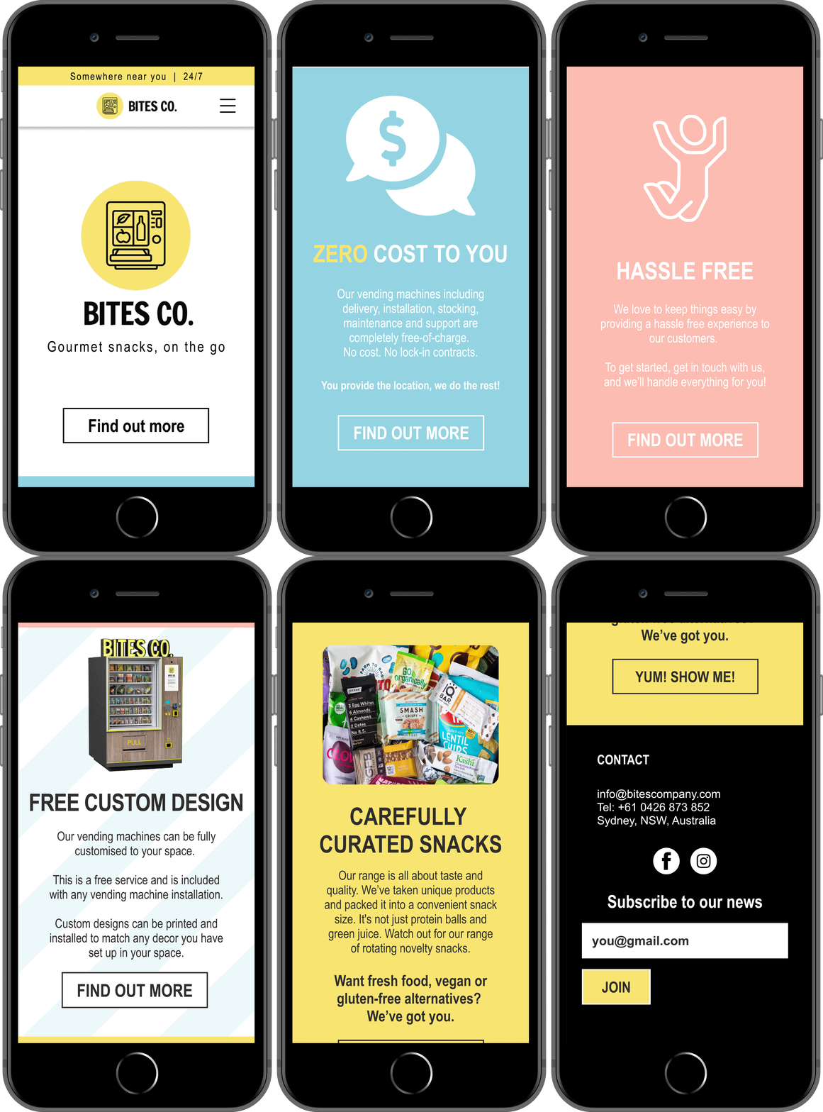
The home page was redesigned so that the content focused on the following propositions; Free of charge services, hassle free processes, vending machine customisation and a variety of snacks (with healthy options). With these selling points front and centre, potential clients should be left in no doubt what Bites Co. offers.
 |
|---|
 |
|---|
Solution 2 - Bites Co. Journey Map
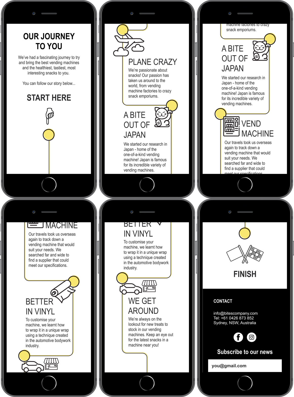
The clients we spoke to said they like knowing about they companies they deal with; it makes them feel like they're part of the process of how their vending machine got to them.
We thought that the story behind the journey to bring the company to where it is today is an amazingly interesting one and deserved to be told.
So we came up with an interactive journey map to illustrate this.
 |
|---|
Solution 3 - Our Snacks
To show the variety of items that Bites Co. offers in their vending machines, we decided to revisit the ‘Our Snacks’ page on the current website.
Whilst the page does show a wide variety of items stocked by Bites Co., we thought that by offering more categories and giving the potential client the ability to stock a ‘Virtual Vending Machine” it would make them more aware of what’s on offer that that their machine snack selection is customisable.
Each snack or drink would have it's own dedicated page, with information like the nutritional value and the background of where the company comes from available for the 'Healthy Harriets' of the world.
 |
|---|
Solution 4 - Vending Machine Customisation
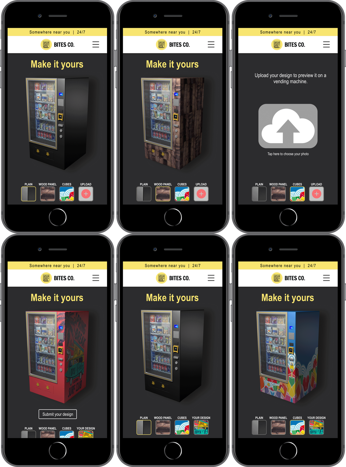
A big part of the Bites Co. value proposition is that the client is able to customise the outside of their vending machine with a vinyl wrap. This is a free service that we found potential clients may not be aware of. The idea of being able to visualise, upload and order customisable wraps was created to raise awareness of this service.
 |
|---|
Solution 5 - Our Snacks Take Home
A successful sales strategy that Bites Co. currently employ is a 'Tasting Session', where the company's staff allow potential clients to try the snacks and drinks that Bites Co. offer. As a tie-in to this strategy our team came up with the idea of a box of snacks that could be sent to a potential client once they fill out their 'Virtual Vending Machine' in the 'Our Snacks' page. The box itself could personalised in the same way that the vending machine has been 'wrapped' from the customisation page.
 |
|---|
Solution 6 - Augmented Reality Application
As part of the onboarding process, we came up with an Augmented Reality application to give the potential customer an idea of how a Bites Co. vending machine would look in their building.
Ideally this would be accessed through a page on the website. Finding a point on the floor, the client would look through their phone and be presented with a virtual vending machine.
This application could also potentially be used by Bites Co. to create mocks to show to potential clients of how their vending machine would look in their building.

Conclusion
As Bites Co. was only initially expecting a some user profiles, they were surprised by the amount of ideas that we had developed from the initial brief. All the deliverables went down well with the client with them taking away several ideas to update their website and their business plan. The 'Our Snacks' take home and Augmented Reality application were received extremely well.
What I personally took away from this project was that a small piece of information can turn a brief on it's head, providing a focus to base solutions on.
A big shout out goes to my team for this project, our Service Designer Rob Leaver, and my fellow UXers Yuki Horinka and Michael Kang.